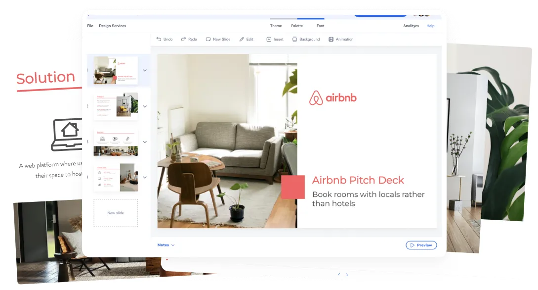
The Original Airbnb pitch deck from 2009 has become an increasingly popular reference for entrepreneurs around the world. The company founders, Brian Chesky, Joe Gebbia and Nathan Blecharczyk used this pitch to raise $600K from Sequoia Capital and Y Ventures. The company has since become a giant in the Travel industry, closing a round in early 2015 on a valuation of over USD $20 Billion.
Originally recovered from a 2011 talk by Blecharczyk on Startup Bootcamp in Boston, we got a glimpse at the exact slides that they used to pitch investors on their original fundraise. The deck was incredibly successful at summarizing the company vision and the huge market opportunity they had before them.
We’ve added all the original slides in this article along with a redesigned version using our Slidebean pitch deck templates, and we’ll be tearing down each one of the slides.


GET EDITABLE VERSION
Airbnb pitch deck outline
- Cover
- Problem
- Solution
- Market Validation
- Market Size
- Product
- Business Model <<< KILLER SLIDE!
- Adoption Strategy
- Competition
- Competitive Advantages
- Team
- Press
- Users Testimonials
- Financial
The slide distribution is actually not far from 500 Startups Investor Deck Template, and follow general presentation storytelling guidelines.
Download Airbnb's Pitch Deck
Let's go slide by slide
1- Cover Slide

Cover slides should stick to the very basics: company name and tagline.
Tagline are actually easier said than done, this should be a 5-7 word sentence that summarizes what your company does. ‘Book rooms with local, rather than hotels’ is a perfect explanation of Airbnb’s service, business model and target audience. It’s written in simple words without any startup jargon.
Defining your product this early on the deck is truly fundamental. If the viewer doesn’t have a good idea of what the product does by slide 2, they are less likely to engage with the presentation.
“If you can’t describe what your product does in 7 words, go back to the drawing board".

Cover slide redesigned in Slidebean. We decided to go with a minimalistic look, using Airbnb's new distinctive pink color, with white for high-contrast. Also, we changed the font from a nice (but standard) Helvetica, to Lato, a simple lightweight font that gives a fresh look to the slides.
USE THIS TEMPLATE
2- Problem slide

I've seen a lot of startups struggle with the problem slide, and I believe that Airbnb solved it marvellously. While a common approach to this is showing an image of the pain or the status quo, the guys at Airbnb went with 3 simple lines that perfectly explain their approach.

For the redesigned version, we made sure that each statement fit in a single line, to improve readability and make the slide look cleaner.
Airbnb's product tries to solve a pricing problem with hotels (line 1), a cultural problem for leisure travel (line 2) and finally a technology problem (line 3), that other competitors like CouchSurfing had tried to solve in the past, unsuccessfully.
Finally, notice how a keyword/keyphrase is highlighted in each sentence. If you are just screening through the slides, those are three words you will absolutely not miss.
Problem slides need to create a connection with the audience or the investor that you are pitching. Make sure they are written in simple words and in a way that allows them to empathize with the problem easily.
3- Solution slide

For the redesigned version, we used Slidebean's integration with TheNounProject to find a set of icons that presented the concept in a more visually appealing and understandable way.

In a similar manner to the Problem slide, the Solution slide should summarize the 3 most important reasons why a customer would buy your product; in other words, your core value propositions.
For your Solution, it's important to talk about the benefits of your product rather than the features. In this Airbnb example, notice how instead of writing something along the lines of 'search thousands of places to stay online', they've summarized it to just 'Save Money while traveling'.
Again, less is more when it comes to pitch decks, and the better you are able to summarize these benefits, the bigger impact you will cause on your investors.
Related Read: Complete Guide to a Pitch Deck Presentation
4- Market Validation
Time to start crunching the numbers. It is only on very rare occasions that a company has absolutely no market comparison.
What you want to do here is provide the closest existing reference to a company in your space, to give investors a real idea of your market opportunity.


Airbnb used a combination of Craigslist and Couchsurfing for their validation. Craigslist had been 'solving' the issue of temporary hosting for a while, and the 17K weekly listings for SF and NY were the best possible proof of a demand for a similar product.
USE THIS TEMPLATE
5- Market Size (TAM)

With a similar importance to the Market Validation side, the Market Size slide should confirm to your investors the size of your opportunity, and should provide 3rd party proof of the size of your industry and its expected behavior for the upcoming years.
For the Market Slide, we made sure that the text in the circles was more visible and relevant in the content of the slide.
Airbnb's Market slide makes a strong emphasis the HUGE 2 Billion+ trips that are booked worldwide on a yearly basis. More importantly, they verify this data with a credible source such as the Travel Industry Association.
Related: What is TAM total available market?
6- Product

Product slides should summarize the core functionality of the product in as few words/images as possible. The Search by City > Review Listings > Book it! helps guide the user in what the interface does, and implies that the process consists of 3 simple steps.
Another great way to approach this slide is with a short 30 second video. A video is truly worth a thousand images, and as long as your technical setup allows it, that's definitely the way you should go. Make sure to keep the images version around in case Internet fails.


For the product slide in our redesigned version, we decided to dedicate one slide to each one of the relevant product images. The original presentation didn't really allow you to appreciate the product, and we believe this approach causes a much better impact on the viewer.
USE THIS TEMPLATE
7- Business Model (<<< KILLER SLIDE!!)

"We take a 10% commision on each transaction" explains the company's business model in a single line, it's perfect! Your business model may be more complex than that, but always make sure that you can summarize it in a line.

Not a lot of changes in the Slidebean redesigned version. We removed the circles to keep some uniformity across the content, and gave more importance to the 10% commision statement.
Airbnb's approach for this slide in their pitch deck was to run a simple projection: assuming that they were able to conquer 15% of the market (and we know those market numbers are accurate because they were reviewed in the previous slide).
With an average transaction fee of $25 the company could easily project $200M in revenue between 2008 and 2011, which is bound to get anyone excited.
We believe this is the killer slide in Airbnb's pitch deck: it confirms their simple business model, the HUGE potential the company has in an existent market, and it defines the vision of the founders on where they expect this product to be in 3 years time.
8- Adoption Strategy

This slide is often called the go-to-market strategy, and should summarize 2-3 core customer acquisition HACKS that you will use to grow the business. By hacks I mean that these methods need to be better, more scalable and more profitable than your competition.
In case of Airbnb, one of their key growth channels was a hack on Craigslist they called the 'dual posting feature'. Basically, they developed a simple program that would automatically post any Airbnb listing on Craigslist, which at that point was one of the few options available to sublet apartments for tourists.

For the redesign version, we removed the logos which we felt were distracting to the point of the slide (and also a bit outdated).
9- Competition

This 2-axis diagram is a perfect way to establish against your competition. By defining Offline vs Online on the horizontal axis, and Affordable vs Expensive on the vertical axis, it's easy to visually convey your point.
Market leaders like CouchSurfing and Craigslist are definitely affordable, but require a lot of offline coordination, far from one-click booking. On the other hand, Orbitz and Hotels(dot)com are online, but significantly more expensive.
Make sure that you define the two core differentiators for your product, and setup the chart so it always shows up on the top right corner. Steve Jobs' iPhone introduction is probably the best example you can find of a similar chart.
10- Competitive Advantages

What you want to do on this slide is answer questions before they come up. Make sure that you point out the core benefits (remember benefits, not feature) that will allow you to outrun your competitors.
Airbnb had significant advantages to make them a (more than) interesting opportunity: first to market, extremely easy to use in comparison to the alternatives in 2009, and more importantly, the host incentive variable that had a direct benefit for the hosts, which literally no other tool could provide.

The layout of the original slide was great, we simply decided to add some icons to make it more visual.
11- Team

We've seen a lot of companies struggle with the team slides, from the amount of information to add about each team member, to the number of team members to actually list on the slide.
As a general rule, my recommendation would be to stick to the founding team for this slide. The hustler/hacker/hipster trio is the ideal combination here. Also, avoid adding advisors to the team slide, they are usually not relevant enough to make the cut for your pitch deck.
Finally, notice how the team at Airbnb focused particularly on listing each founder's entrepreneurial achievements, rather than their academic titles. In the end, experience matters A LOT more.

USE THIS TEMPLATE
12- Press Slide
These slides are here to provide validation a credibility, as long as you have a credible source to quote. Your Press slide proves that your concept is interesting enough to be featured in __________, and that your team was clever enough to get you featured.
As for the user testimonials, make sure to pick reviews that talk about the core benefits of your product, as a confirmation that your customers are understanding the underlying value.


13- Users Testimonials
For the press and the testimonials slides, we decided to cut down the number of quotes to 3, to allow larger, and more readable text.


14- Financial Slide

Finally, your financial slide or 'the ask' should have the details of your round or fundraising efforts. Be very careful about the information that you disclose here, general solicitation legislation prohibits the disclosure of some information, that might jeopardize your company and even your investors in the future.
As a general rule, stay on the safe side. Keep a public version of your deck with no financials, that you can share around to get intros and meetings. Once you have an established link with your investor, disclose the details of your company financials and projections.
Improve your Startup Financials

We hope you find this article useful and that you can learn something from the success of Airbnb's pitch deck. Please leave your thoughts in the comments below.
I think it's safe to say that having an amazing business was the single most important reason for their success to date, but ensuring that the business vision is portrayed correctly, especially in the early stages, is fundamental to get your investors excited.
If you're interested in using this deck as a template, we recommend giving Slidebean a try.


