The 10 Best Presentation Design Agencies in 2025

Presentation quality is key to a winning business pitch. It is important to note that high-quality presentation designs have many advantages over text papers or lengthy PDFs.
If you want to improve your company's reputation or boost sales as a startup or an established business, having a clean and professionally made presentation design is key. That can only be achieved with the help of presentation design services.
What are the presentation design services?
In today's world, it's so hard to keep people's attention. If you want to inform and engage your audience effectively, your presentation must be well developed, illustrated, and organized, whether it's a sales pitch, a training session, a large conference, or an investor update.
By using presentation services, the ideas and concepts in any presentation will be made much clearer and more appealing.
Some presentation services include
- PowerPoint Presentation
- Pitch deck Presentation
- Sales Presentation
- Pitch Presentation, and more.
A Presentation Design Company bring your slides to life, transforming them into professional slides that will win investors. Also, through presentation services, every subject is presented more perceptively and intelligibly.
How much does making a PowerPoint presentation cost?
In front of your audience, your PowerPoint presentations serve as your resume. As a result, since this is one of the first things they see, this is where they will form an impression of you, either satisfactory or not.
If you want to outsource your PowerPoint presentation design to a design agency, knowing how much it will cost will help you get prepared.
The cost of a PowerPoint depends on various factors. These factors include
- The number of slides.
- The timeline.
- Preliminary work
- The complexity of the project.
- Animation requirements
- The style
- Content and design elements
At Slidebean, a presentation design costs $39 per slide, depending on how quickly you need it; design improvements can cost up to $400 to $799 for less than 20 slides in a 5-7 business day delivery. The price increases if the presentation is needed urgently.
The prices vary with different agencies, but the factors remain the same.
Slidebean Users get a 10% discount on their presentation redesign services
Top 10 best PowerPoint presentation design services online
The best approach to acquiring innovative, expert, and high-quality presentation designs is by working with the best presentation design agency.
Here are the top 10 PowerPoint presentation design service
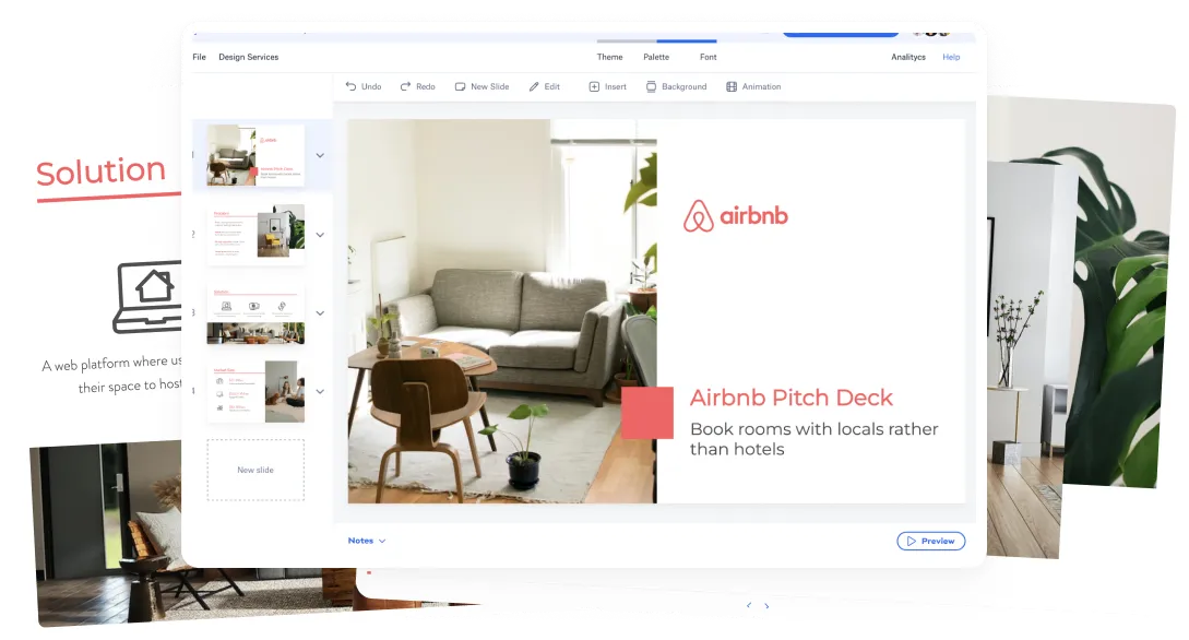
#1. Slidebean

Slidebean presentation design agency
They also prepare effective presentations for fundraising, sales and more, making them a good fit for both startups and established businesses. Slidebean pitch deck services has been able to help its clients to raise over $300m combined.
They also provide finalized and exquisitely created templates, making replacing the contents easier. One of the best things about Slidebean is their ability to get their clients a winning pitch deck.
Start a project
How much is a pitch deck?
Instead of working on a lengthy 20–100 page detailed business plan that only a few individuals get to see, more firms and startups choose the adaptable Pitch Deck approach. That's because a Pitch Deck is a streamlined and more functional version of your business plan/strategy, containing only the information that will motivate and drive action.
Your Pitch Deck will act as the basis for all forms of communication, including your website, advertisements, and others, which is why getting the best agency to build your pitch deck is essential.
Freelancing platforms like Upwork or Fiverr advertise their top pitch deck professionals as charging between $35 and $250 per hour for people with no expertise.
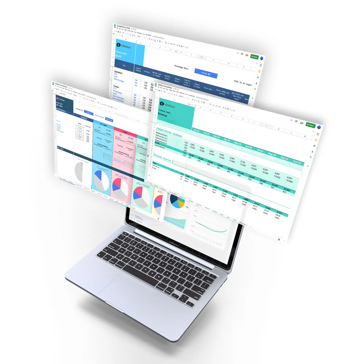
However, the average starting price for a comprehensive pitch deck at professional agencies like Slidebean ranges from less than $1,500 to $10,000. What you will get is a polished and expertly made entire pitch deck. Slidebean works on writing the content, designing the slides, and building the financial models as well.
Therefore, if your business is something you are passionate about and compelled to do, make a sizeable financial investment in constructing a high-quality pitch deck.
#2. Buffalo7

This PowerPoint design agency uses storytelling to create a powerful pitch deck to set you and your ideas apart. In addition to creating investor pitch decks, they also create keynote and marketing presentations.
#3. BrightCarbon
Bright Carbon pays a lot of attention to the message you want to deliver. They create content to be compelling and visually explain your ideas.
They provide services that fall into animations, eLearning, training, and graphic design and have clear pricing plans.
#4. 24 Slides

24Slides is an agency that provides numerous presentation design options and helps with business PowerPoint designs. With their visual communication skill, they specialize in presenting difficult information to your clients in a clear and simple-to-understand way.
#5. Mr.Prezident

Mr. Prezident is a premium presentation design agency representing itself as "the presentation partner of optimistic enterprises."
They offer various services and provide templates, training, videos, slide management, and creative services. They use Prezi, PowerPoint, Keynote, and other presenting software to create their presentations.
#6. Fully Decked Up

Fully Decked Up takes PowerPoint design to the next level. They provide PPT touch-ups, a full-blown visual makeover, and bundles for prepackaging presentations.
#7. Ethos3

Ethos3 believes in using the three Es' to help you engage, energize, and empathize with your audience. They offer content creation and presentation design for corporate presentations.
#8. SlideRabbit

From straightforward slide design to intricate animations and interactive visuals, infographics, and visualizations, SlideRabbit's presentation design agency offers exceptional creative innovation to any business.
SlideRabbit creates presentation graphics for legal services and marketing materials using PowerPoint slide designs, Keynote presentations, and infographics.
#9. Big Fish Presentations

To properly communicate your brand message, Big Fish blends design, copywriting, and presentation skills into one. Big Fish helps clients make emotional and meaningful presentations. Something that has an impact and inspires.
#10. SlideGenius

SlideGenius creates stories in images. They give you the chance to expand your customer base and revenue dramatically.
Takeaway
Slidebean believes that captivating stories make for persuasive presentations, and captivating stories make unforgettable experiences.
Amazingly, Slidebean pitch decks achieved high conversion rates in the past few years! Compared to other PowerPoint design services on the market, they are better suited for sales meetings. The Slidebean team has been involved in the drafting and designing of hundreds of investor decks. We’ve helped companies raise $250 million combined!
What do presentation design agencies do?
If you really what to get people sitting on the edge of their seats and hanging onto your every word, telling a story has the power to do just that. That is what presentation design agencies bring to the table – great storytelling.
The main goal of presentation design agencies is to help businesses to communicate effectively through their presentation.
To help businesses and professionals improve the look of their presentations, presentation design agencies offer a wide range of specialized design services. These services range from organizing the information and visuals you already have in your presentation to starting from scratch.
So, from defining clear objectives and selecting captivating themes to the final presentation, presentation design agencies help their clients communicate clearly, effectively, and memorably through a visually-appealing presentation.
How to choose The Right Presentation Design Agency for You?
Choosing the right presentation design agency can be tricky and challenging. This is partly because numerous agencies are available to help you design a presentation, but not every agency is the same in terms of quality.
When choosing the right presentation design agency, here are some things to consider
- What kind of service do you need?
Before looking for a presentation design agency, know what kind of service you need and what type of presentation you want. This is because many presentation design agencies offer various services that are not relevant to your needs.
For instance, some only provide the slide designs, paying little attention to the texts. In contrast, other agencies, in addition to helping with the aesthetic designs, would also help you improve your texts and use stronger and more persuading.
Therefore, knowing your presentation's goals and what kind of service you want would help you find the right agency.
- Do they have the skills?
Ensure that the agency you want to choose has what it takes to meet your needs. A good presentation design agency should be capable of a variety of skills. First and foremost, look out for design skills. It is a necessary skill set for a design agency to possess. Also, check out some of their skills before you make a decision.
- An impressive portfolio?
A portfolio is self-explanatory. You can see what the agency can design after looking at two or three presentations. Therefore, looking at a presentation design agency's portfolio may help you determine whether or not they are a good fit for your needs.
There are a few things to consider when you check the portfolio.
- Are there samples you like?
- Are the designs good?
- Do the design style and content fit your needs?
Answer these questions when going through their portfolio. Hire a design firm only after reviewing their past projects.
- Are they worth their asking price?
"Are they worth their asking price?" Some agencies charge high design rates but deliver low-quality designs. Therefore, check out their portfolios or chat with their previous clients to determine if they are worth the asking prices.
- Diversities
Finally, know diverse they are when making presentations. An agency should cover sales presentations, investor-related presentations, webinars, product launches, fundraisers presentations, and much more. Alongside this, apart from PowerPoint, they should work on different platforms like Google Slides, Slidebean, and Keynote.
Get started today with the best presentation design agency if your business is ready to experience all the benefits of a top-notch presentation design service!
Start a project
Related video


Let’s move your company to the next stage 🚀
AI pitch deck software
Free sign upPitch deck services
Start a project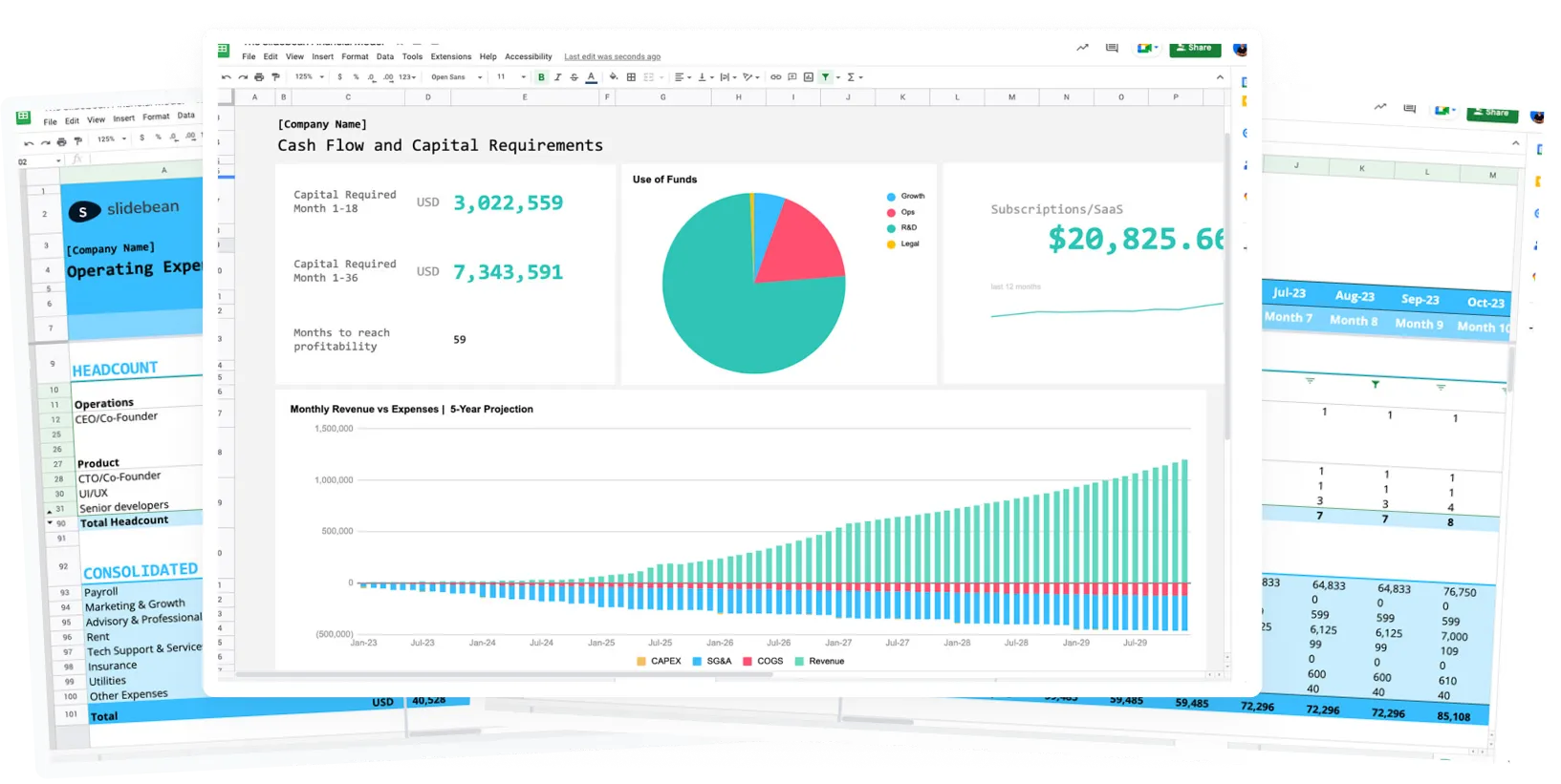
Financial Model Consulting for Startups 🚀
We can help craft the perfect pitch deck 🚀