Slidebean 5.0 is here! A quick overview of the latest release

My, how time flies! Five versions of Slidebean already! I promise you we don’t want to go down the rabbit hole of naming versions with numbers, Apple-style, and the number is somewhat irrelevant.
The real point is that we’ve grown (and luckily, learned) a lot over the course of 6 years and that growth is reflected in the 5 major releases we’ve done so far (roughly, one major update per year since 2014).
We always like to do a quick rundown on the things that have changed, the motivation behind these changes, and what can be achieved with the new version.
Motivation
Our goal has always been making things easier for users looking to create high-quality slides.
Simplicity and efficiency have always been the names of the game, and that means stripping off our user interface and the experience from unnecessary distractions. This we do in order for you to focus on what matters most: your content.
Our job is to know where to put the needle in the user control and automation scale. Our product team is constantly calibrating where that needle is placed for all the major actions on our app, and we bulked a few of these actions into this release!

What changed
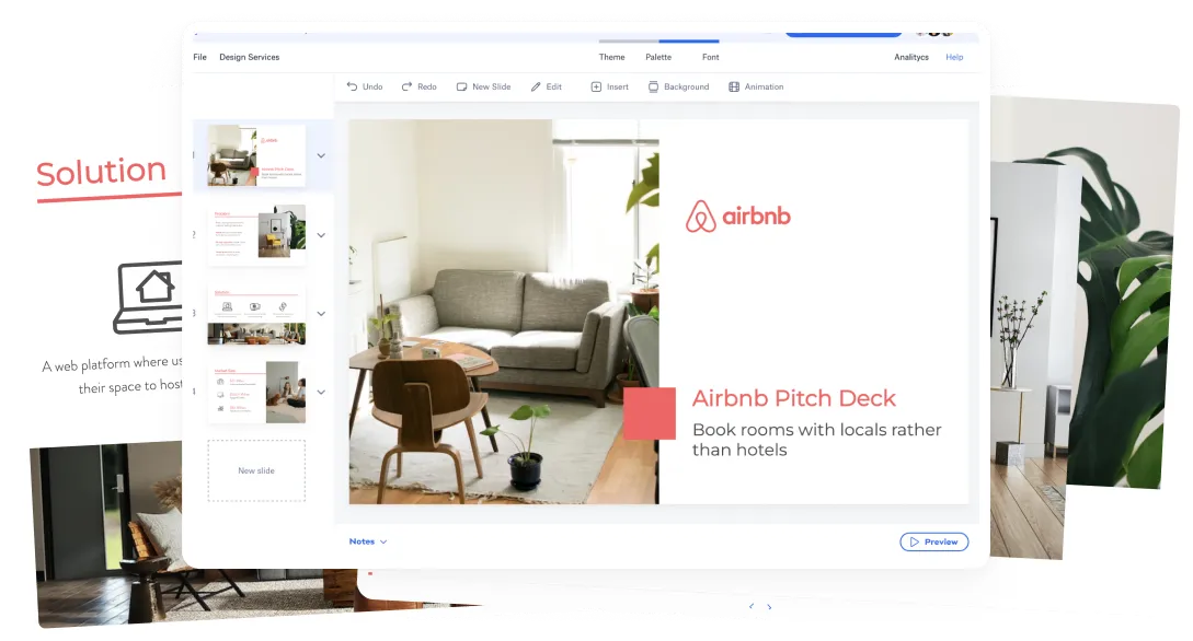
Pretty much all the changes in this release are related to the Editor.
Undo-Redo
The long-awaited undo-redo functions have finally been implemented into Slidebean, for any change performed to the presentation on a single session. That means you can revert back any change you’ve done, from the arrangement of the slide to recovering elements you’ve just deleted!

Settings Bar
Our newly implemented settings bar will now let you access important functions inside the editor that were somewhat hidden in previous versions of the app. We hope this new visibility will help you find things easier and perform actions that were tricky to find otherwise.

Naming a presentation
Now you can add and change your presentation name directly on the Editor. It’s no longer necessary to visit the Dashboard to do that.

Notes
Now you can find your presenter notes on the lower part of the editor in a panel that integrates more seamlessly with the slide above them.

AI controls
You can now pause or trigger the “Arrange with AI” command directly on the Layout option on the settings tab. This way you have full control over whether or not you want the AI to assist you on a specific slide.

Bigger canvas
Thanks to the new arrangement of elements within the UI, the canvas for the slide is now bigger for increased readability and ease of use.

Design menu always accessible
You can now access all the design options from the OUTLINE and DESIGN modes alike. This will help you reach them quicker, and reduce the number of clicks to get there.
Hotkeys
We’ve implemented several hotkeys to help you work even more efficiently. They are the following:
On Mac:
⌘O: Switch to OUTLINE
⌘D: Switch to DESIGN
⌘P: Preview
⌘A: Arrange with AI
⌘Z: Undo
⇧⌘Z: Redo
On other OS’s:
Ctrl+O: Switch to OUTLINE
Ctrl+D: Switch to DESIGN
Ctrl+P: Preview
Ctrl+A: Arrange with AI
Ctrl+Z: Undo
Ctrl+Shift+Z: Redo
Lessons learned
For some time, we resisted following some paradigms of interfaces used by bigger and older presentation software, mainly because we wanted to provide a better-rounded experience. In an attempt to break the mold and be innovative, we wanted to give our users a radically different tool top to bottom, and that extended to changing many aspects of how elements were laid out on the presentation editor. Time, however, has taught us some important lessons.
The first: familiarity is not always bad
We’ve learned that attempting to break a pattern too ingrained into people’s minds can generate friction, and compromise adopting a new tool, even when that tool will make your life easier. We have adopted a new perspective in which we’re only being innovative in the areas of the experience that truly require it. Only stripping off unnecessary commands and patterns, and only proposing a new order of things in areas where we’re positively convinced they’re needed.
Second: moving the needle slightly towards more customization
In order to make room for more creative freedom, and more editing options for advanced users, we’re moving the needle slightly left. We’ve come to realize that giving users a little more control and visibility over functionality will make working in Slidebean even easier. These, of course, are optional resources, and automation will always be there for those who need it and are happy with the tool taking care of things.
The platform has always been and will continue to be, a smart design assistant. We just want to continue to listen to our clients’ feedback and needs and adjust accordingly to provide ever-improving usability.
Once again, our ultimate goal is to provide a smooth user experience that makes your life easier. We take our design and presentation-making knowledge and test it against the feedback gathered from users across the globe. The outcome of that is a constant opportunity to improve and iterate to continue to deliver a better experience when creating slides. Thanks to all the users who make this synergy possible, and please take the new Slidebean editor for a spin and let us know what you think!
