If you’ve ever founded a startup or worked in one, then you might be familiar with Brex. Founded in 2017 by Henrique Dubugras and Pedro Franchesci, Brex aimed to solve a pretty clear issue: entrepreneurs struggle to obtain credit cards.
Over the years, Brex became an artificial intelligence-powered spending platform for startups. It is valued at over $12 billion and has raised over a billion dollars in venture capital funding.
But let’s rewind to 2018 when Brex was the new kid on the block. How did two 22-year-olds kickstart their fundraising and win investor confidence? This article will analyze the 2018 pitch deck that helped them secure $57M in funding.
First, we need to understand a pitch deck: it's more than just a presentation; it's a story that sells your vision, aiming to build trust and investment interest.
Let’s analyze the overall story arc from Brex’s deck:
- Cover
- Team & Investors
- Problem
- Problem
- Status Quo
- TAM
- Target Audience
- Solution / Secret Sauce
- Product
- Features
- Features / How it Works
- Features / How it Works
- Features
- Business Model
- Traction
- Traction
- Unit Economics
- Why Us
At Slidebean, we specialize in creating tailored pitch decks. We’ve been perfecting a general story structure that we believe most decks should follow.

While the deck has a couple of exceptions, the overall story flow does adhere to the structure established by Slidebean.
Let’s analyze now each slide of the pitch deck:
1 - Cover Slide

Cover slides are the opening act of your pitch deck and should be clear and concise. What should be featured here is only the company name and tagline.
Remember, the taglines in investor decks are different from those in marketing. They should be a brief phrase summarizing what the company does in no more than 7 words – a challenge critical for first impressions. All decks need a cover, but adding a tagline maximizes this important ‘real estate’ and teases the reader on what comes next.
2- Team slide

In startups, it's often about who you know and the connections you've made. Investors tend to bet on founders as much as the business ideas themselves. A key way for founders to establish credibility is by highlighting endorsements from well-known investors and showcasing their previous professional experiences. This approach is effectively used in the team slide of the pitch deck.
Typically, team slides are placed at the end of a deck. But, if the founders' or investors' profiles are particularly impressive and vital to the story, placing them at the beginning is a common and effective strategy.
3 - Problem Slide

Creating a problem slide can be tricky, as it's easy to fall into the trap of overcomplicating or discussing solutions. The key is to focus on the core issue the company is addressing.
The best problem slides are:
- Crystal clear
- Concise
- Undebatable
- Data-driven
We see Brex didn’t really dedicate much time to the design aspect of their deck. However, they manage to solve this wonderfully. With a powerful title and images that support that claim, they go further and strike an emotional fiber in one's brain by showcasing real images of rejection. Kudos.
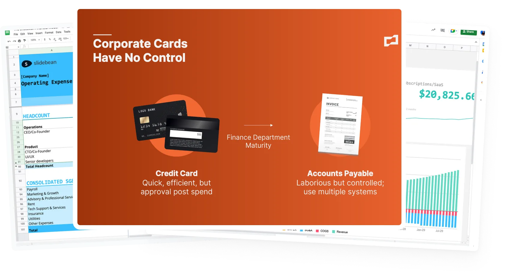
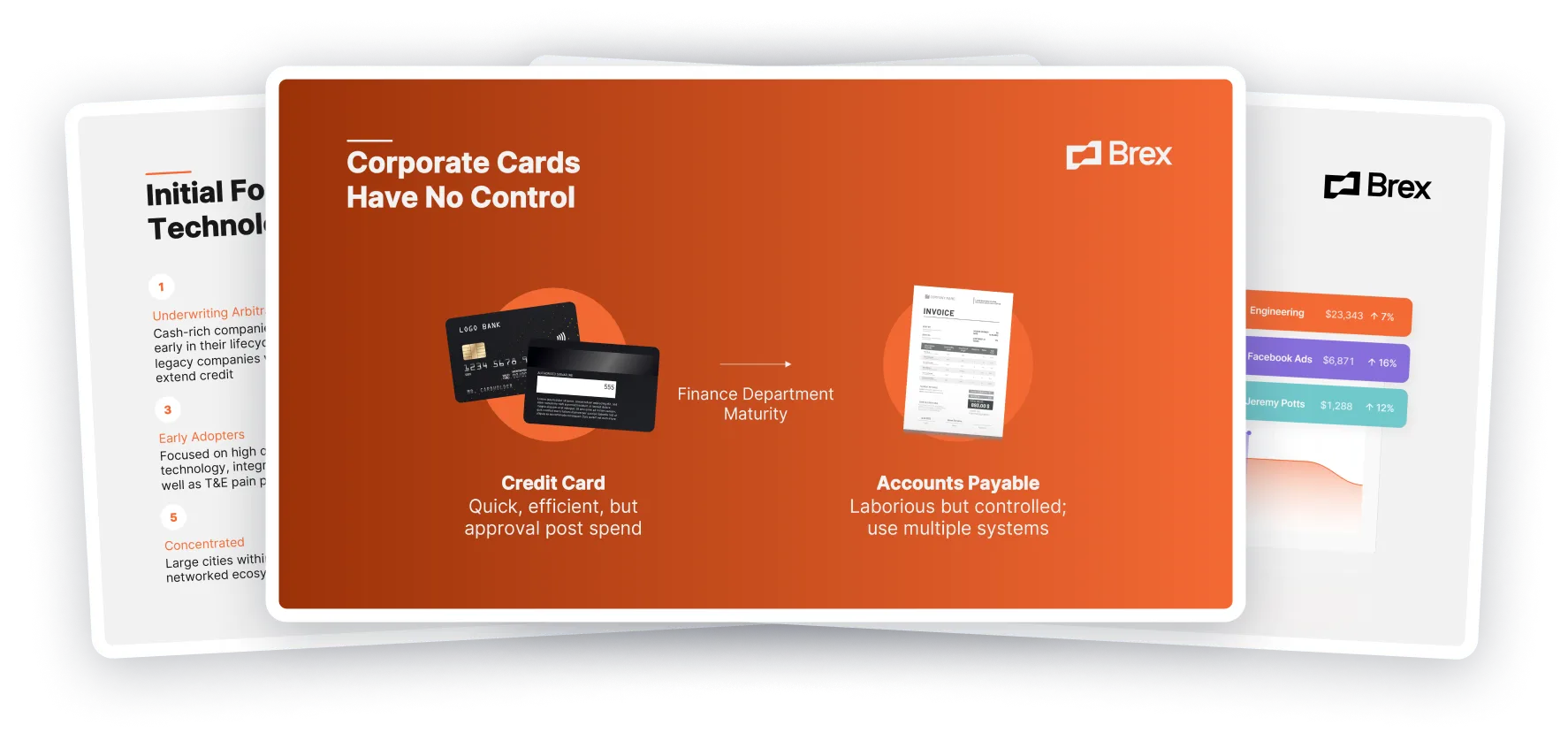
4 - Problem Slide #2

This slide is harder to digest than the previous one. While having a clear title, this next slide gets a bit tangled in its execution. The diagram and wording leave room for confusion, shadowing the intended message. Particularly, it's not immediately apparent what the consequences are of a lack of control over corporate cards. It would have been helpful to dive deeper into this issue, providing a clearer understanding of the problem.
5 - Problem slide #3

It’s difficult to understand what’s going on here. This is a bit of a head-scratcher. It seems like design wasn’t a top priority here. My take on this is that the aim appears to be explaining the industry's current state and how it functions, but the delivery is somewhat muddled.
You may wonder, 'Why three problem slides?' While three problem slides are on the upper limit of too many slides for defining a problem, using 2-to-3 slides provides a clearer, more manageable problem understanding and will avoid jamming everything into one slide.
6 - TAM

First, let’s start by stating that a market opportunity slide is different from a TAM slide. The market opportunity slide should highlight market behaviors and trends, explaining why the field is ripe for disruption.
On the other hand, the TAM slide should talk about the actual market size of the company. We actually have a really cool video discussing how to calculate it.
Notice how we’re already through the sixth slide of the deck and still have no clue at all about the solution or what the company does. Something to be mindful about that can really negatively impact your pitch deck story.
7 - Target Audience

Still no sign of what Brex is.
The target audience slide is well-done, clearly identifying their pain points and the specific demographic they aim to serve. However, the placement of this slide raises questions. It’s an intriguing choice to delay introducing the company's core offering, a strategy that could be seen as unconventional in a typical pitch deck structure.
8 - Solution

Finally, this slide gives us a glimpse of what Brex is about. However, it's unclear if this was intended as a solution slide, and if so, it misses the mark. Ideally, the solution slide should begin with broad information, answering core questions like "What is Brex?" and how it addresses the fundamental problem of entrepreneurs struggling to get credit cards. The slide hints at key features but lacks an overall product description, leaving a gap in the narrative.
9 - Product

In the product slide, Brex's approach is more about generating excitement than providing clear, concrete information about the product. The card, a central element, is tucked away in a corner, less emphasized than the text, which itself falls short of giving a detailed insight into the product. This style leans more towards creating intrigue rather than offering a straightforward explanation of the product's features and benefits.
10, 11, 12, & 13 - Features


Slides 10 through 14 provide a deep dive into the product's key features.
I would have liked more text here to explain how the particular feature works and adds value. ERP Integrations by itself doesn’t really provide any details to us. Some images can stand by themselves and are self-explanatory, yet others don’t.
There is also a discrepancy between the format used in these slides. Some go the extra mile and tell us how that feature works (Better Controls), while others don’t. Some provide details about the actual feature (Receipt Capture), and some don’t.
Slide 14 is a classic example of what to avoid. Honestly, this slide had me scratching my head. Is this supposed to be a business model slide or -another- features slide?
Your readers should have no struggle in reading and understanding each slide.
15 - Traction

And…. here comes the traction slide to save the day. After navigating through some less impactful product slides and a somewhat -confusing- storyline, this slide marks an inflection point with its compelling data.
It speaks volumes, showcasing the kind of exponential growth that investors look for. Despite missing specific units and numbers, the graph's upward trajectory is evident. This growth curve undoubtedly signals to the market and potential investors that Brex is doing things right.
16 - Traction

Following the growth trajectory slide, we see another crucial aspect of Brex's success: customer retention. This slide reinforces the company's momentum, highlighting that not only is Brex expanding rapidly, but it's also retaining its customer base. This kind of data is exactly what investors look for - a clear indication that the company is addressing a significant, unresolved market need and has the numbers to prove its efficacy. The emphasis on data-driven metrics here is key, solidifying the narrative of Brex's market traction.
17 - Unit Economics

Aside from a difficult-to-read table, this is a pretty solid slide. Again, wise and strategic choice of what data to showcase. These are the unit economics that an investor would be keen on knowing after two traction slides.
18 - Why Us

The final slide of Brex's deck serves as the founders' closing statement to investors. It's their chance to crystallize why investing in Brex is a wise decision. However, this slide doesn’t quite hit the mark. It touches on the founders’ understanding of payments and building a large-scale enterprise infrastructure but lacks the persuasive, data-driven punch that a compelling "Why Us" slide requires.
It should have included more concrete data, like specific achievements of their product, their market traction, or highlighting the investors who have already shown confidence in them.
In wrapping up, let's acknowledge the missing elements in Brex's pitch deck: the Go-to-Market, Business Model, Roadmap, Competitive Landscape, and Fundraising slides.
These are crucial as they answer pivotal questions about user acquisition, the monetization structure and its scalability, the company's future direction, competitive edge, and funding specifics.
It is no secret that the deck is far from optimal, yet they managed to raise $57M with it. Odds are that this is their email/teaser deck. A deck intended to be shared around and become quite public, thus reserving some key information for later in the investment process (or follow-up) meetings.
This is the proof that there are some non-negotiables in fundraising:
- Problem - Solution fit: How well can your solution fill in a market gap
- Founder - Problem fit: A founding team that can relate to the problem and is poised to grow the company to scale
- Traction and solid unit economics: The living proof you’re doing something (or everything) right.
The bottom line is that great ideas and killer businesses will thrive no matter what as long as they have a solid team to execute them.
