Is Pitch Deck design relevant?
Let's get something out of the way first: it's your business model, your vision as a founder, and your ability to pitch that will determine if you get funding or not. We are not going to argue that. Still, your pitch deck design matters.
Designing a pitch deck that stands out can say a lot about the stage your company is in and your ability to execute. All internet companies rely on high engagement and high conversion rates to grow, and the only way to achieve that is with a remarkable UX design.
Whether you use a pitch deck template or hire a professional pitch deck design service , this presentation is a reflection of the ability you and your team have to generate a product that is intuitive enough to reach mass adoption.
The best pitch decks are an extension of what the startup is already doing. They portray what's being done, how it's being done, and how it can be done better with more money. Without a doubt, the best pitch decks make a compelling case for investment. Check out our Pitch Deck Examples from Successful Startups.

What makes a good pitch deck?
A pitch deck is the roadmap to success for any ambitious entrepreneur. The key ingredients for a winning deck are a clear and compelling narrative that highlights the problem at hand, an innovative solution that grabs attention and sets you apart from the competition, and evidence that you're on the path to success. Visuals that pack a punch and drive home your message are a must, and let's not forget the cherry on top: a call-to-action that compels the audience to take action. All these elements combined, creates a recipe for a Pitch deck that will not only inform but also inspire.
What to include in a pitch deck?
We cover this on several articles, and videos, but here's a summarized version: A pitch deck is a visual presentation that is typically used during fundraising and business development efforts, it should include the following key elements:
- Introduction: A brief overview of your company and the problem you are solving.
- Market and industry analysis: A look at the market opportunity and the competitive landscape.
- Product or service: A detailed description of your product or service and how it addresses the problem.
- Business model: An explanation of how your company will make money.
- Traction: Evidence of your progress to date, such as revenue, user numbers, or partnerships.
- Team: A brief introduction of the key members of your team and their relevant experience.
- Financials: Projections for growth and financial performance, including revenue and expenses.
- Ask: Clearly state the funding or action you are seeking from the audience.
- Conclusion: A summary of your key points and a call to action.
- Bonus: Additional slides like testimonials, case studies, or user interviews can further add value to your pitch.
Here's a video we produced that explains it better:
Please refer to those first before working on the design part of it. Ready? Let’s get to it, then:
How can you make an attractive pitch deck?
Pitch Deck Design: Fonts + Text + Amount of content
Be sure to make your pitch slide engaging with legible content. Stick to big, bold fonts with highly-contrasting backgrounds. It's more than just about aesthetics. No one wants to expend effort reading a slide. If the text is not easy to understand, your audience will lose interest and zone out.
The main issue when addressing text is how much is enough, and when to stop. Most presentations derive from previous materials, like page documents, and because of that people tend to go a little overboard when adding information to a presentation. The main issue with this is that if a slide is full of text, people either ignore it completely in order to listen to you, or worse even, ignore you in an attempt to read what’s written. Best advice we can give you is do NOT type *everything* on the slides, rather, use only keywords to help the audience (and yourself) keep up with your story. Keep text to an absolute minimum.
Break it down into simple parts. Each slide should convey a single idea that doesn’t require a degree in rhetoric to decode. Your talking points don’t need to take up all the real estate on your pitch deck either. If you put a dense paragraph on a slide, it’ll prevent your audience from absorbing your main points.

Charts
The simpler, the better. A great chat is not one that has a ton of data but one that represent what you're explaining in a clear way.
If you’re using charts or graphs on a slide, that information should be immediately apparent. Think about how the figures or facts connect to your central premise and focus on what you want the audience to get from the slide.
Finally, bear in mind that complex data sets were never meant to reach the presentation medium. They take too long to understand. Due to their complexity, the font becomes too little, and therefore they are pretty much impossible to read from the audience perspective. So the answer is: DON’T.

Imagery
Keep in mind that people remember images better than text. Be sure to include attractive photos that dramatize your talking points. The images should be relevant, bright and unique. A high-quality image lets you play up that visual on the slide. If you have a lot of text to incorporate, use half the space for writing and the other half for the image. Don’t try to squeeze in too much; one high-quality visual that sums up the central theme is enough. If the slide warrants multiple pictures, be sure to arrange them aesthetically. Borders or frames should be added to each image. As a rule, images are best when used to tell your story more succinctly.

Also, DO NOT use stock photos of people at a meeting room, posing towards the camera, nor any clip art of characters solving a puzzle, or the absolute worse: two guys in suit shaking hands. Not only does it look absolutely hideous, but no one can relate to those images. They are super fake and make you look like a really bad presenter. Check out these great sources of photos, so you don’t have to use them ever again.
Additional Inspiration
To get an idea of how your pitch deck might look, take a peek at some of these templates.

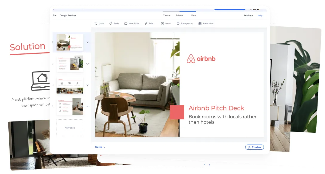
Successful behemoths like Facebook and YouTube have used pitch decks to launch. Mark Zuckerberg turned his dorm room project into a success using pitch decks to receive $500,000 from a billionaire venture capitalist. It included the company’s value proposition, marketing plan, traffic and key metrics. Airbnb is a platform that allows folks to find and rent lodging. It’s one of the greatest startups of all times, and its pitch deck is a favorite for entrepreneurs. This company used great text in its intro and hooked its audience. Even a 5-year old could have understood what its business is all about.
Remember, the best pitch decks demonstrate that you understand what your business is all about and who your customers are, but don’t waste an opportunity to reinforce your brand to investors.
What does your company need?
Let us Design your Pitch Deck
Related video


Let’s move your company to the next stage 🚀
AI pitch deck software
Free sign upPitch deck services
Start a project
Financial Model Consulting for Startups 🚀
We can help craft the perfect pitch deck 🚀